Top Sherwin Williams Neutral Colors Palettes For Home Exteriors
If you’ve ever driven by a home and thought, “Wow, that house just looks right,” chances are the secret lies in its color palette. As a Realtor here in St. Petersburg, I’ve seen firsthand how the right paint colors can elevate curb appeal, attract buyers, and increase resale value. That’s why I’m thrilled to share the Top Sherwin Williams Neutral Colors Palettes For Home Exteriors, featuring expert insights from Avalon Group Realty’s Broker Aaron Hunt and Realtor Pam Amante.
Aaron Hunt says it best: “The exterior of your home is your first handshake with the world. A thoughtful color palette creates emotion, and emotion sells homes.”
What is a Neutral Color Palette?
Neutral colors are muted tones with minimal saturation. Common neutrals include white, beige, gray, taupe, and black. While they may seem simple at first glance, the magic lies in their undertones. Some lean warm with hints of yellow or red; others lean cool with touches of green or blue.
The beauty of neutrals is their adaptability. They can serve as serene backdrops or bold statements when paired with contrasting accents. For St Petersburg Home Sellers, choosing the right neutral exterior palette can dramatically widen appeal, ensuring your home looks timeless and market-ready.
And here’s the exciting news: for the next decade, warm, organic tones are taking center stage. Gray is no longer the star it once was. Instead, Organic Exterior Colors — those soft, welcoming neutrals that don’t look yellow — are redefining what “timeless” means in home design.
Alabaster & Tricorn Black
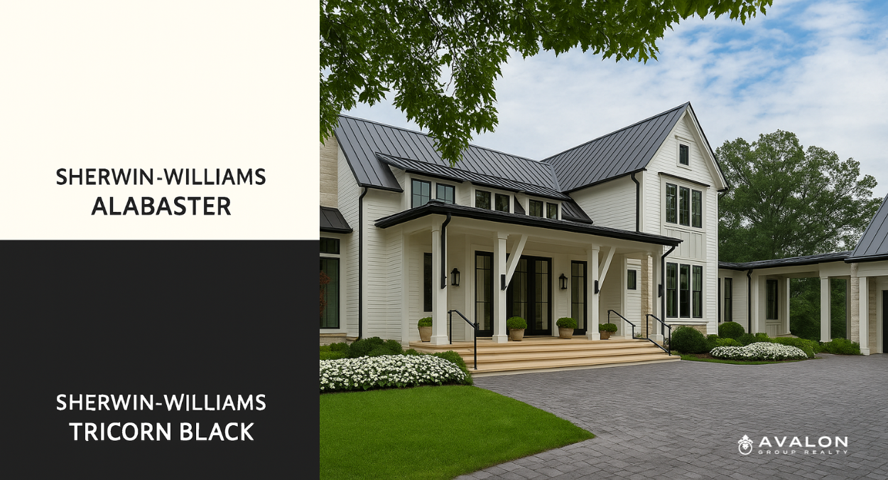
#1 Alabaster & Tricorn Black
Sherwin Williams Alabaster (SW 7008) is one of the most beloved whites for good reason. This warm, off-white carries subtle beige undertones, which keeps it from appearing stark or sterile. With a Light Reflectance Value (LRV) of 82, it reflects plenty of light, allowing homes to feel bright and open even on overcast days. Unlike pure whites that can feel harsh in Florida’s strong sunlight, Alabaster softens the exterior and conveys serenity. Homeowners often love it because it feels versatile — it’s a white that adapts beautifully to both modern and traditional homes.
On the other end of the spectrum, Tricorn Black (SW 6258) is Sherwin Williams’ boldest and truest black. With an LRV of just 3, it absorbs almost all light, creating a deep, saturated tone. The beauty of Tricorn Black lies in its neutrality; it carries virtually no undertones, which means it pairs seamlessly with any shade. When combined with Alabaster, the effect is striking. The contrast creates crisp, clean lines that highlight architectural details such as trim, shutters, and front doors.
Pam Amante says, “Alabaster and Tricorn Black is the ultimate high-contrast pairing. It’s elegant, timeless, and universally appealing. I’ve seen it elevate everything from bungalows to modern coastal homes here in St. Pete.”
Drift of Mist & Mountain Peak White
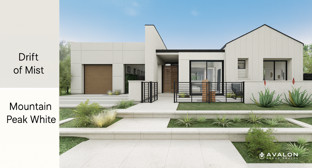
#2 Drift of Mist & Mountain Peak White
Drift of Mist (SW 9166) is one of Sherwin Williams’ most adaptable neutrals. Often described as a greige, it straddles the line between gray and beige, shifting depending on the light and surrounding elements. In bright Florida sunshine, it leans lighter and warmer, while in shaded areas, its subtle green undertones emerge, creating a soothing and natural look. With an LRV of 69, Drift of Mist provides brightness without being stark, making it an inviting choice for homeowners who want a modern yet cozy exterior.
Complementing Drift of Mist is Mountain Peak White, a warm off-white with just enough yellow undertone to feel sunny and cheerful without tipping into gold. With an LRV of 74, it brings a luminous quality to exteriors, helping trim, columns, and accents pop against the main body color. This pairing is ideal for buyers searching online because the combination photographs beautifully, giving homes a polished look in listing photos. Many St Petersburg Home Sellershave chosen this palette specifically because of how inviting and marketable it makes their home appear.
Wool Skein & Porpoise
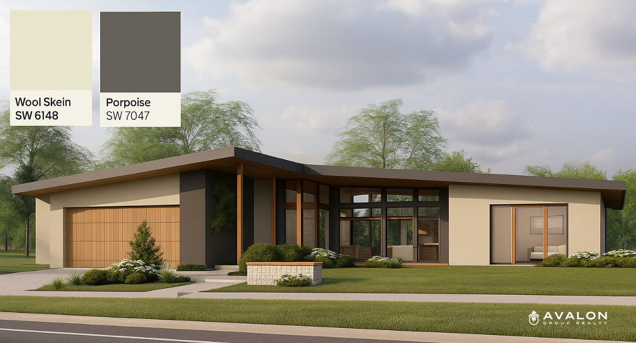
#3 Wool Skein & Porpoise
For homeowners who want warmth with grounded sophistication, the combination of Wool Skein and Porpoise is a winner. Wool Skein (SW 6148) is a warm beige-tan infused with subtle gray, giving it the adaptability of a taupe. With an LRV of 63, it sits in that sweet spot where it feels light enough to be inviting but substantial enough not to wash out. Depending on the time of day, Wool Skein can reveal hints of green, red, or even yellow undertones, which means it carries a dynamic character that prevents it from ever feeling flat.
Porpoise (SW 7047), on the other hand, provides the richness that balances Wool Skein’s softness. This dark, warm gray with bronze-brown undertones has an LRV of 13, meaning it absorbs most light, creating depth and drama. The earthy complexity of Porpoise makes it perfect for trim, shutters, and doors. Together, Wool Skein and Porpoise create a palette that feels both welcoming and luxurious. This pairing works particularly well on Craftsman homes or properties with natural stone features, where the colors enhance rather than compete with the architecture.
Nuance, Accessible Beige & Intellectual Gray
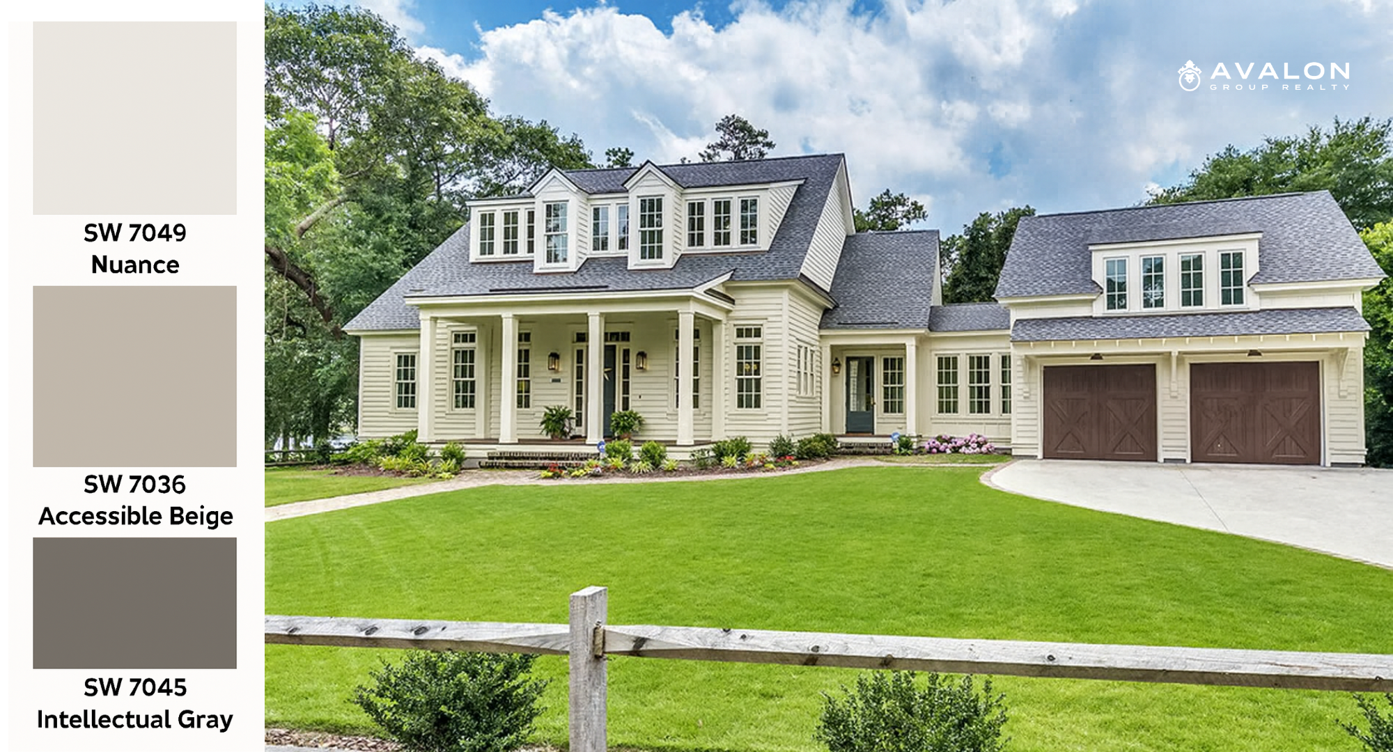
#4 Nuance, Accessible Beige & Intellectual Gray
The trio of Nuance, Accessible Beige, and Intellectual Gray is perfect for homeowners who crave dimension without stepping away from neutrality. Nuance is a soft white with cool green undertones, giving it an earthy, organic edge. It feels grounded and natural, making it a soothing alternative to true whites.
Accessible Beige (SW 7036) adds the middle layer of this palette. With gray undertones that temper its warmth, it provides flexibility and works equally well as a body color or accent. With an LRV of 58, it falls comfortably between light and dark, making it the “bridge” between shades.
Finally, Intellectual Gray (SW 7045) brings depth. This moody, warm gray shares a kinship with Accessible Beige but with more saturation. The result is a sophisticated palette where all three colors transition harmoniously, creating a monochromatic exterior that feels dynamic without being overwhelming. For larger homes with multiple design elements, this trio adds interest and polish.
Urbane Bronze & Natural Choice
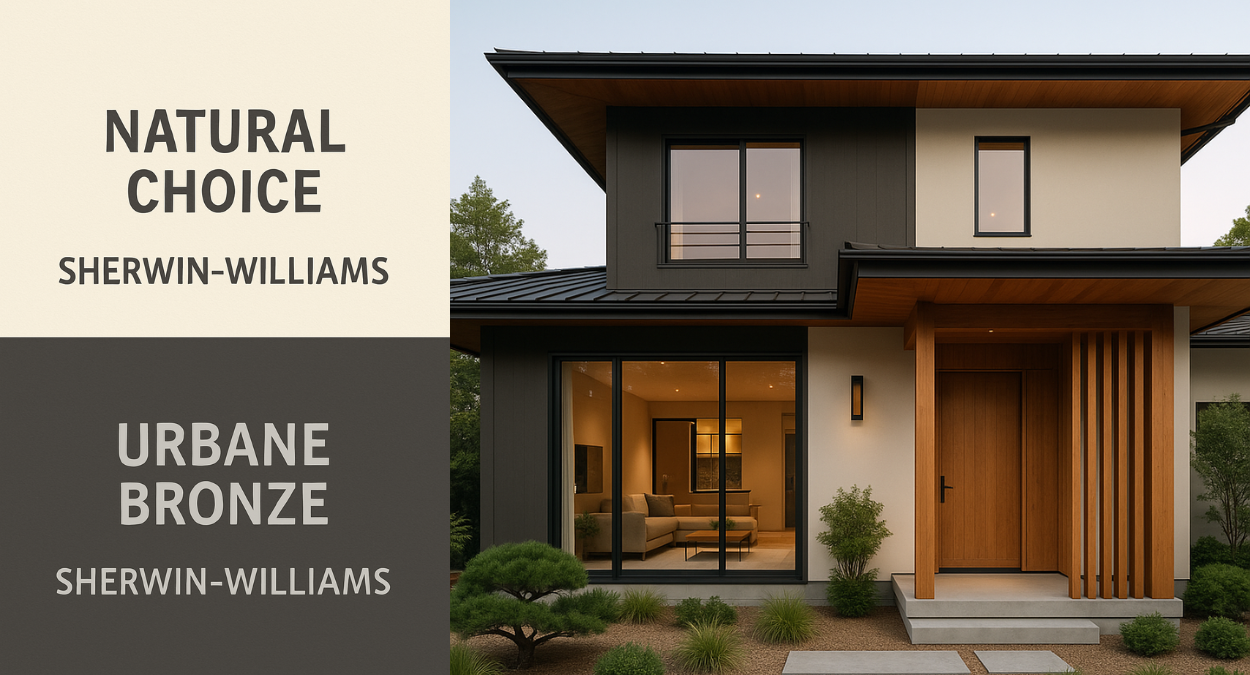
#5 Urbane Bronze & Natural Choice
When Sherwin Williams named Urbane Bronze (SW 7048) their 2021 Color of the Year, it cemented this shade’s reputation as a modern classic. Urbane Bronze is a deep greige with earthy undertones, evoking the grounded feel of stone, wood, and metal. With an LRV of 8, it’s bold, moody, and dramatic, yet it carries warmth that makes it approachable.
To balance this depth, Natural Choice (SW 7011) serves as the perfect counterpoint. This creamy off-white has cool undertones that keep it feeling fresh and bright. Together, these two create an exterior that feels modern, sophisticated, and inviting.
Aaron Hunt observes, “Urbane Bronze is incredibly powerful when paired with a soft off-white like Natural Choice. It feels rooted and modern, and it works beautifully in Florida neighborhoods where buyers want warmth without sacrificing elegance.”
Agreeable Gray & Iron Ore
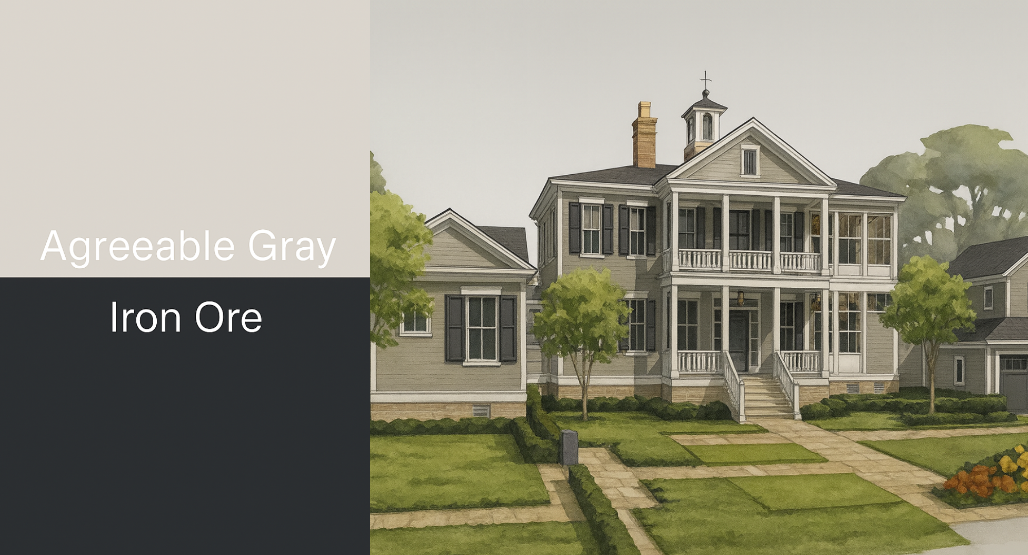
#6 Agreeable grey & Iron Ore
Agreeable Gray (SW 7029) has become one of Sherwin Williams’ most popular colors for a reason: it is the quintessential greige. Balancing gray and beige with a hint of green undertone, it adapts effortlessly to varying lighting conditions. In natural sunlight, it appears warmer; in shaded areas, it leans cooler. With an LRV of 60, Agreeable Gray offers just the right amount of brightness, making it a timeless choice that feels both cozy and modern.
Iron Ore (SW 7069) is the dramatic companion to Agreeable Gray. Though it appears nearly black, it is actually a charcoal with brown undertones, which softens its intensity. This makes Iron Ore more versatile than true black, lending itself to exteriors that want bold accents without harshness. When paired with Agreeable Gray, the combination feels balanced, welcoming, and undeniably stylish.
Peppercorn, Oyster White & Urbane Bronze
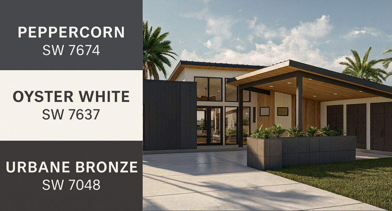
#7 Peppercorn, Oyster White & Urbane Bronze
Peppercorn (SW 7674) is a deep, sophisticated charcoal gray with subtle blue and purple undertones that can shift depending on lighting. With an LRV of 10, it absorbs light but maintains enough nuance to avoid feeling flat. Used as siding or an accent, it provides drama and elegance.
Oyster White (SW 7637) offsets Peppercorn with warmth. This soft off-white has subtle green, beige, and gray undertones, giving it a chameleon-like ability to adapt to different settings. It feels cozy, bright, and versatile, which is why it works so beautifully in Florida’s strong sunlight.
When Urbane Bronze is added into the mix, the palette becomes even richer. Urbane Bronze brings earthy grounding to the trio, complementing both Peppercorn and Oyster White. The result is a bold, dynamic exterior with high contrast that still feels organic.
Evergreen Fog & Shoji White
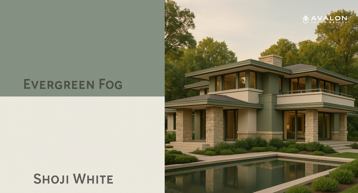
#8 Evergreen Fog & Shoji White
Evergreen Fog (SW 9130), Sherwin Williams’ 2022 Color of the Year, is one of the most beautiful examples of Organic Exterior Colors. This soft green-gray with subtle blue undertones provides a calming, nature-inspired presence. With an LRV of 30, it is a mid-tone that adds depth without feeling dark. It evokes tranquility, making it ideal for homeowners who want a serene and inviting exterior.
Shoji White (SW 7042) is the perfect complement. A warm off-white with subtle green undertones, it harmonizes beautifully with Evergreen Fog by lightening the palette without introducing starkness. Together, these colors create an exterior that feels modern, earthy, and connected to nature, a look that resonates strongly with today’s buyers.
Dovetail & Greek Villa
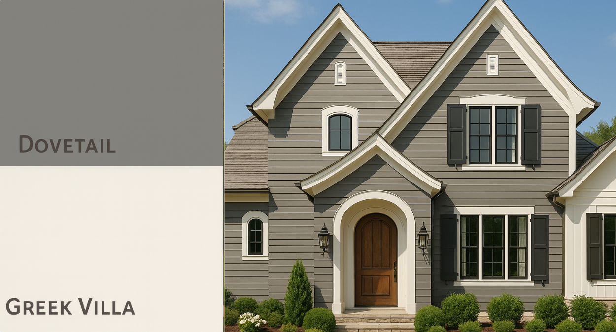
#9 Dovetail & Greek Villa
Dovetail (SW 7018) is a medium gray infused with earthy undertones, which keeps it from appearing cold. It feels sophisticated and grounded, offering a rich backdrop for architectural details.
Paired with Dovetail, Greek Villa (SW 7551) provides the brightness and warmth needed for balance. This creamy white has sunny undertones that keep it from feeling sterile, ensuring that exteriors appear inviting and cozy. The contrast between Dovetail and Greek Villa is striking yet soft, creating a cohesive look that works beautifully for ranch homes or Mediterranean-inspired Florida architecture.
Natural Linen, Anonymous & Inkwell
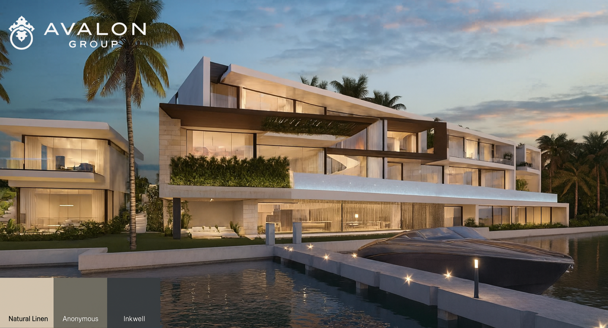
Palette #10: Natural Linen, Anonymous & Inkwell
For homeowners seeking a luxurious, layered palette, Natural Linen, Anonymous, and Inkwell create a stunning combination. Natural Linen (SW 9109) is a warm beige with soft gray undertones, offering a refined and airy base. It looks particularly elegant on stucco, where its warmth enhances Mediterranean-style homes.
Anonymous (SW 7046) provides the mid-tone depth. This earthy greige with olive undertones grounds the palette, making it an excellent choice for gables, garage doors, or accent walls.
To complete the trio, Inkwell (SW 6992) adds richness. Unlike Tricorn Black, Inkwell carries subtle navy undertones, which soften its appearance and add dimension. Used for shutters, front doors, or trim, it feels both modern and luxurious. Together, these three shades create a palette that is timeless yet bold, perfect for high-end properties looking to make a statement.
Why Neutrals Sell Homes
Neutral exteriors don’t just look great — they sell homes. Buyers are more likely to imagine themselves in a property that feels welcoming yet versatile. Bold colors may turn away some buyers, but neutrals appeal across demographics.
Pam Amante adds, “When I show buyers a neutral home, the first thing I hear is, ‘I can see myself here.’ That reaction is priceless.”
Bullet Recap: The 10 Best Palettes
Alabaster & Tricorn Black
Drift of Mist & Mountain Peak White
Wool Skein & Porpoise
Nuance, Accessible Beige & Intellectual Gray
Urbane Bronze & Natural Choice
Agreeable Gray & Iron Ore
Peppercorn, Oyster White & Urbane Bronze
Evergreen Fog & Shoji White
Dovetail & Greek Villa
Natural Linen, Anonymous & Inkwell
FAQs: Top Sherwin Williams Neutral Colors Palettes For Home Exteriors
Q: Why are neutral palettes better for resale?
A: They appeal to the widest pool of buyers and enhance curb appeal.
Q: Are grays still in style?
A: Pure gray is fading, but greige and warmer neutrals are in high demand.
Q: What are Organic Exterior Colors?
A: Nature-inspired neutrals with warm undertones that blend seamlessly with outdoor surroundings.
Q: Which palette is best for luxury homes?
A: Natural Linen, Anonymous & Inkwell for its rich yet versatile look.
Q: How often should Florida homes be repainted?
A: Every 7–10 years, but humidity and salt air may shorten the cycle.
Final Thoughts
The Top Sherwin Williams Neutral Colors Palettes For Home Exteriors prove that neutral doesn’t mean boring — it means timeless, sophisticated, and market-ready. Whether you love bold contrast or soft organic tones, there’s a palette here to fit your home and neighborhood.
Aaron Hunt sums it up: “Exterior paint is one of the most impactful updates homeowners can make. When done right with neutral palettes, it increases both beauty and value.”
If you’re considering selling or updating your home, reach out to me and the Avalon Group Realty team. We’ll help you choose the right palette and position your property for maximum impact.
Stay Connected with Avalon Group Realty
Facebook: Avalon Group Realty
Instagram: @avalongrouprealtors
Twitter: @AVALONGROUPRE
TikTok: @avalongrouprealty
Check out this article next